Sunday, 25 September 2011

Collage + Inspiration


Insparation 


.

Concept: Space & Shape

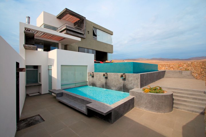
I found the style that Ian Moore uses the space of his Architecture strongly open
as if there shouldn't be any boundaries between outdoor and indoor. Also the shapes he uses: square/rectangular.
My concept from these is that How the building should interactive with surrounding environment
such as day/night system, weather and natural environment.
Also square/rectangular shape forms rhythm of users movement.

Sunday, 18 September 2011

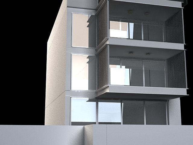
Render Images

Exterior
(no photoshop)

Real

Renders


Interior
(no photoshop)


Real


 Renders


Ian Moore Extra Research - Case Study

Air by Ian Moore
above existing Oasis Shopping Centre at BoardBeach, Queensland


This building has used standing out colours like yellow, which kidda different to
standard colour use of Ian Moore.
 this is symmetrical building, which everything is structured in a perfect grid.
There is patterns for windows positions each building for open area.

Group - Less is Moore

Group names and Links


Architect : Ian Moore
Frangipani : 280 Campbell Parade, Bondi Beach Sydney


Surrounding Environment

 Front View

Back View

Plans 1


Plans 2


Plans 3


Plans 4


Plans 5


Models


Sunday, 21 August 2011

Final Videos

Sandbox Editor Environment Video


BuildAR Video


Draft Poster & Final Poster


ZAHA HADID POSTER


Firstly there arent many posters about Zaha Hadid' work, i chose this one out of three.
This poster is pretty much eye catching, it takes my eyes to the main background image and to three images on top right hand corner then to the car bottom left hand corner.
I think their visual direction is really interesting 
beside their background image helps it with curvy shape.
Font uses are pretty well done, using bold font for the title and the starter word.

 DRAFT POSTER LAYOUT


 DRAFT POSTER

FINAL POSTER